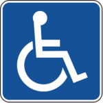
Disabled symbol
| Symbol | Disabled |
| Religion | Social/Cultural (Accessibility symbol, not religious) |
| Origin | The International Symbol of Access (ISA), commonly known as the wheelchair symbol, was designed by Danish design student Susanne Koefoed in 1968 as part of a competition. |
| Meaning | It symbolizes accessibility, inclusion, and rights for people with disabilities. |
| Appearance | Appearance: The symbol usually depicts a person using a wheelchair, often in white on a blue background. |
| Colors | Traditionally, it's depicted in white on a blue background, though variations exist |
| Usage | It's used worldwide to indicate accessible facilities, parking spots, and services for people with disabilities. |
| History | It has been widely adopted since its creation in the late 1960s, becoming a universally recognized symbol. |
| Popularity | It's highly recognizable and widely used in public spaces globally. |
| Importance | It's crucial for promoting accessibility and advocating for the rights of people with disabilities. |
| Complexity | While the symbol itself is simple, its implications for accessibility and inclusion are complex and multifaceted. |
| Emotions | It can evoke feelings of empowerment, inclusion, and recognition for people with disabilities, as well as frustration when accessibility is lacking or ignored. |
The International Symbol of Access: More Than Just a Wheelchair
The most recognized symbol for disability is the International Symbol of Access (ISA), often referred to as the wheelchair symbol. While the image depicts a person in a wheelchair, it represents a broader concept: accessibility for individuals with all types of disabilities.
Beyond Physical Disabilities:
While the wheelchair signifies physical limitations, the ISA extends to those with:
- Sensory impairments (visual, hearing)
- Cognitive or intellectual disabilities
- Mental health conditions
- Invisible disabilities (e.g., chronic pain, learning disabilities)
A Call for Inclusion:
The ISA serves as a reminder to design and build environments that accommodate everyone’s needs. It’s not just about wheelchair ramps; it encompasses accessible transportation, communication, information, and services.
More Than Just a Symbol:
The ISA is a powerful tool for:
- Raising awareness about disability inclusion
- Advocating for accessible spaces and practices
- Promoting the social inclusion of people with disabilities
Remember:
- The ISA is not limited to designated disabled parking spots; it represents a wider movement for accessibility.
- Language around disability is evolving; avoid outdated terms like “handicapped.”
- Focus on the individual, not just their disability